Problem
Their original website did not present their content in an efficient or clear manner. The dull look of the website lacked appeal and did not promote the company in a positive manner.
Their original website did not present their content in an efficient or clear manner. The dull look of the website lacked appeal and did not promote the company in a positive manner.


The website provides information on the services the company offers as well as resources available. The objective of the website is to not only list information to site visitors clearly, but in an enticing way as well.

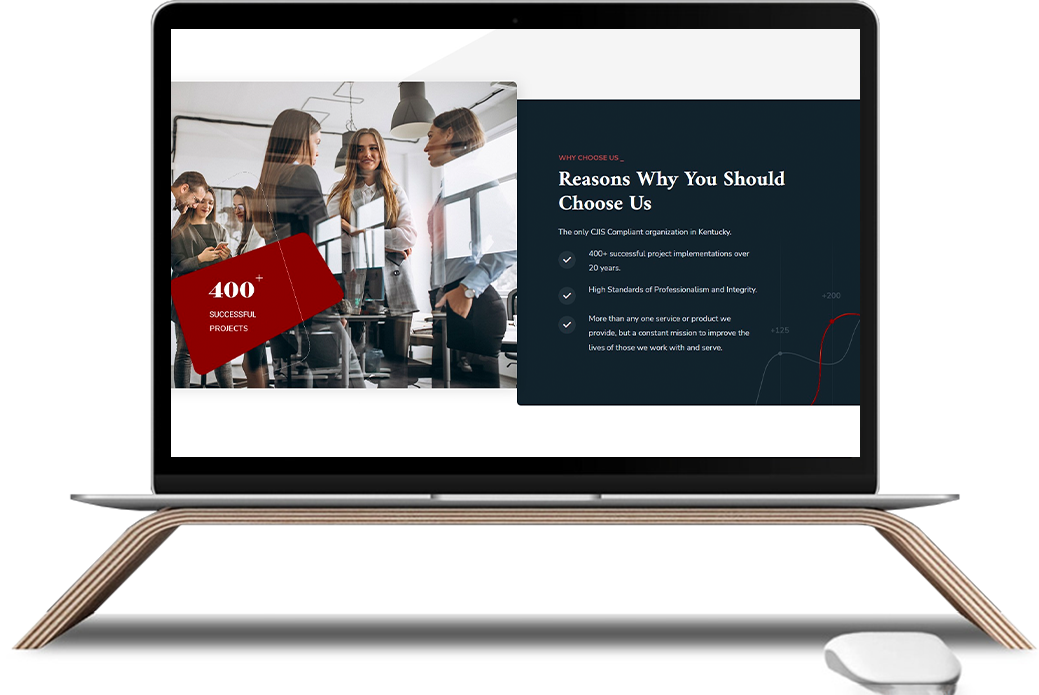
We revamped the website to create an engaging platform with vibrant images and drawings, interactive features, and having a clean cut design. We used a mixture of images, diagrams, and sections of text to create an appealing website that not only presents well aesthetically but concisely as well. However, we made sure not to compromise on the readability of the content, and used a contrast of a clean white background with the blues and reds incorporated throughout the website design. We gave the website a modern feel that would be sure to attract its viewers.


