Invicta Consulting provides a variety of services for both individuals and small businesses to grow and thrive such as business registration, business financing, retirement planning and bookkeeping.

With so much content to cover, Invicta was in need of having an easy to navigate website without compromising on information. However, their original website was maze-like with no structure in place. There was no clear division in the different types of information on the website and it seemed to be a never-ending list. Furthermore, the design of the website did not help as the colors used made it hard to read what was on the website, adding to the difficulty of digesting the information presented. The website also contained many broken links and had slow responsiveness.
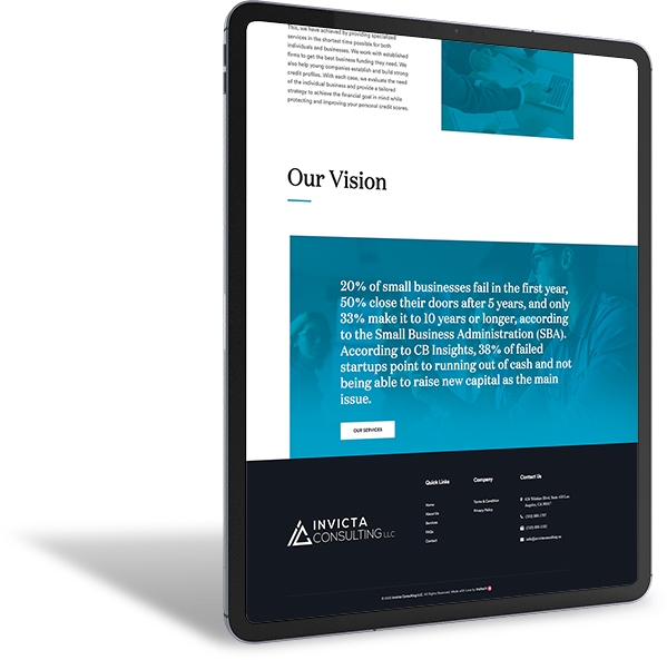
In order to restore direction in the website, we made sure to make clear sections in a way that would be easy for viewers to navigate and find exactly what they are looking for.
We gave a new look to the website in terms of colors and branding making sure the site looked vibrant.
Because of the heavy content load, we made it easier for clients to read the text through the design style choices, legible font choices and sizes of the text.
We made sure to fix the backend issues by addressing the slow loading speed of the website pages and also fixing a number of broken links.
Fail In
First Year
Close Their Doors
After 5 Years
11 Years
Longer