Or Famous Blogs
What Are The Top 10 Reasons For Responsive Web Design?
Published Wed Feb 16
Every day, the concepts of web designing are changing rapidly. New ideas, technologies, and developer platforms are introduced to assist developers and designers. Among these, Responsive web design is one of the concepts most widely being used nowadays.
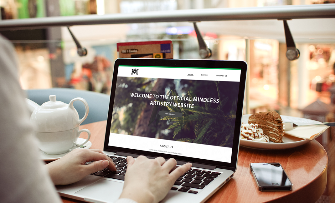
Responsive web design is the approach of web development to change dynamically the appearance of a website on different screen sizes and orientations. It is adopted to increase the readability and easy navigation without shrinking and zooming the web page. It gives uniformity in user experience, no matter which screen size a user is using.
So, why does a business having an online presence need a responsive web design? On this page you will get to know the top 10 reasons for responsive web design:
- Great step towards the new era of web designing – Responsive web design is one of the most powerful and modern concepts. Now, websites are becoming more accessible with this.
- Amazing user experience (UX) – Responsive web design gives its users amazing comfort and user experience from all types of devices.
- Keep up with the competitor – If you want to be ahead with your competitors your website needs a responsive web design. All the leading businesses invest in responsive web design for their website rather than adaptive web design.
- One website for different devices – Responsive web design makes your life easier; it doesn’t require a different website for smartphones. A single platform is needed for maintaining and updating and making your life hassle-free.
- Real cost savers – Businesses that use responsive web design say that it is a one-time investment, but it will save your money in the future.
- Cater to the large group of mobile users – Recently, the use of mobile phones for surfing has been increased drastically.
- Easy for online marketing and SEO – It is a hassle for marketers and developers to run different versions of the website and then marketing all one by one. Responsive web design makes it easy by handling just the steering wheel.
- Preferred by search engines – According to many researches and surveys, a responsive web designed website ranks high as compared to other websites with the same content but not responsive. Google search engines and others like Yahoo and Bing prefer responsive web design. This gives the benefit of more traffic and ultimately the conversions.
- Supported by CMS platform – For marketers, CMS is the most preferred platform for updates and maintenance. These CMS platforms use a responsive theme for the website and know that in the future mobile phones will become crucial for accessing the websites, So, it requires a great user experience and responsive websites.
- Smart saving – For smart working, you need a smart design to save your money. Now, it is important to invest in responsive web designing as in the future this concept will be going to lead.
How Effective Is Responsive Web Design?
Responsive web design is an effective tool for your website. It will make your website mobile-friendly, optimize the screen view in all screen sizes, increase the stay of users of your website and improve your ranking in Google search engine.
To work effectively, responsive web design uses responsive layouts such as different fluid grids layouts, fluid content, and images. It analyzes the width of the screens a user is using in order to get the space available and display the website with respect to the size. With the use of its main components, it makes an impact on accessibility. These are mentioned below:
- Fluid grid designs
- Fluid images and content
- Media Queries
- Settling the viewpoint
For more details on these components, go to our blog: What Is Responsive Web Design?
What Will Happen When You Apply Responsive Web Design To Your Website?
When you apply responsive web design to your website, the following changes take place:
- Website layout – Responsive web design works with pixels at first to fit with different screens.
- Media responsiveness – With the use of correct media queries, images and content are placed appropriately depending on the different browsers.
- Test the layout – The responsive web designing work will not stop just displaying the text and images. The designer then tests the layout with different users and screen sizes to see if it is working or not.
You now have a better idea of how responsive web design is working, why it is important to have responsive websites, and its reason. So, it’s high time to have your website adapt to these changes; otherwise you will lose your potential customers and be no more.
Return to Main Blog Page >