© Copyrights 2021. Insitech. All Rights Reserved

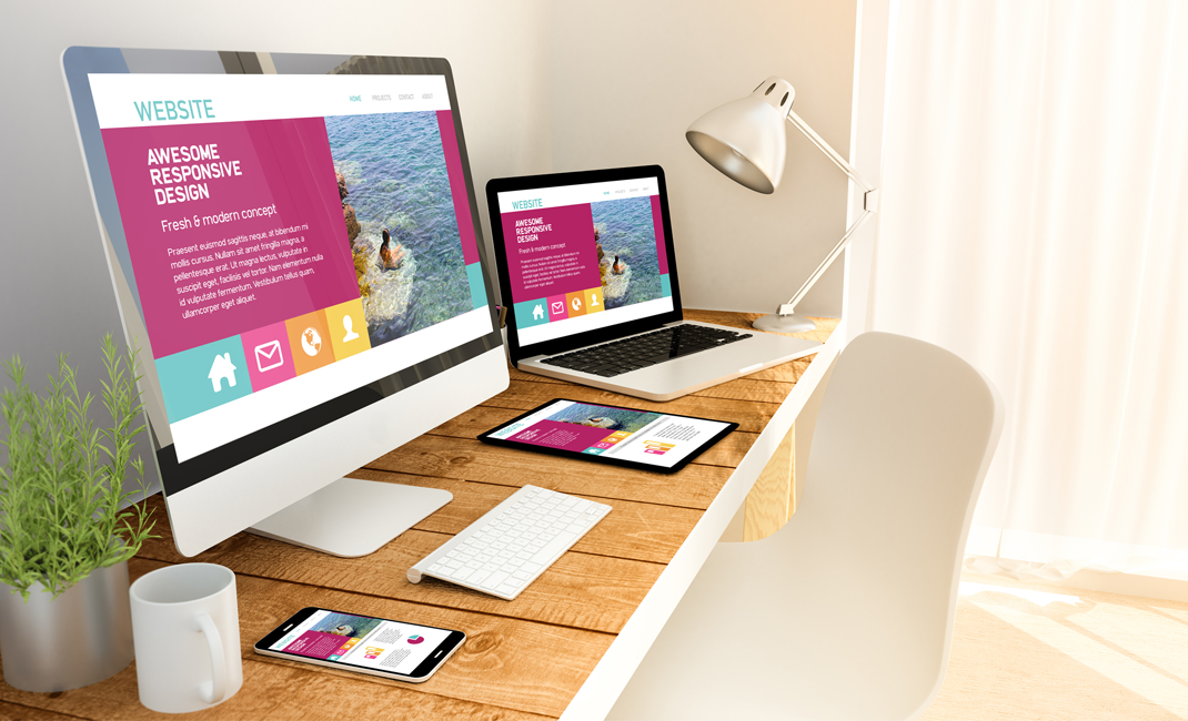
Have you ever thought about it? How can a single website stay the same on different screens? This is probably due to responsive web design.
Responsive web design is the approach of web development to change dynamically the appearance of a website on different screen sizes and orientations. It is one of the approaches to solve the problem of making separate websites depending upon the screen sizes.
Generally, responsive web design uses the principle of “mobile-first,” which means the design is first experienced in smartphone platforms followed by tablet and desktop. This approach is driven by the understanding that nowadays people access the website on their smartphones more as compared to large screens. Moreover, smartphones have more capabilities compared to laptops and desktops; for instance: GPS, touchscreens, accelerometers, and much more.
Responsive web design is beneficial for creating separate websites depending upon the type of devices the customer used. Because of this, the development process becomes faster in comparison to the development process of 3 to 4 separate websites. It also reduces the cost and time of maintenance because just a single codebase and content needs to be updated or upgraded with time instead of 3 to 4 codebases. Responsive web design is future-proof in the sense that it can support new breakpoints at any time. For example, if a 7-inch device or 14-inch device launches in the market, the responsive web design code can also support these new devices. It doesn’t bound the design to a specific screen size.
To determine how the layout of the website will appear on screen, responsive web design uses breakpoints. That is how one content or image appears above the breakpoint and the other content or image appears below the breakpoint. Commonly, breakpoints are based on the browser’s width. Another element of responsive web design is the page elements reshuffling with respect to the viewport. For example, a three-column web design for the desktop reshuffle to two-column and one-column web design for tablet and smartphone, respectively. Depending upon the proportion-based grids responsive web design reshuffle design elements and content.
The responsive web design approach emerged to provide information equally accessible on all devices. But it is possible to remove certain elements like background images or secondary content on small size screens. The decision of removing these elements on a smaller screen depends on the users’ needs and knowledge.
How Do Responsive Websites Work?
Responsive websites work through the Cascading Style Sheets (CSS). Based on the screen size, resolution, orientation, color capabilities, and other properties of the device, various settings are applied to serve different styles in a multitude of screens.
Mainly, there are three major components involved in the process of responsive web design.
Why Is Responsive Web Design Important?
Responsive web design makes the life of designers, developers and owners easier. Here are some of the reasons why it is important:
Responsive design permits you to cater to a broader audience and engage them wherever they are using to browse. It is important that a website should be responsive in order to prevent it from alienating customers due to poor responsive design.
Return to Main Blog Page >